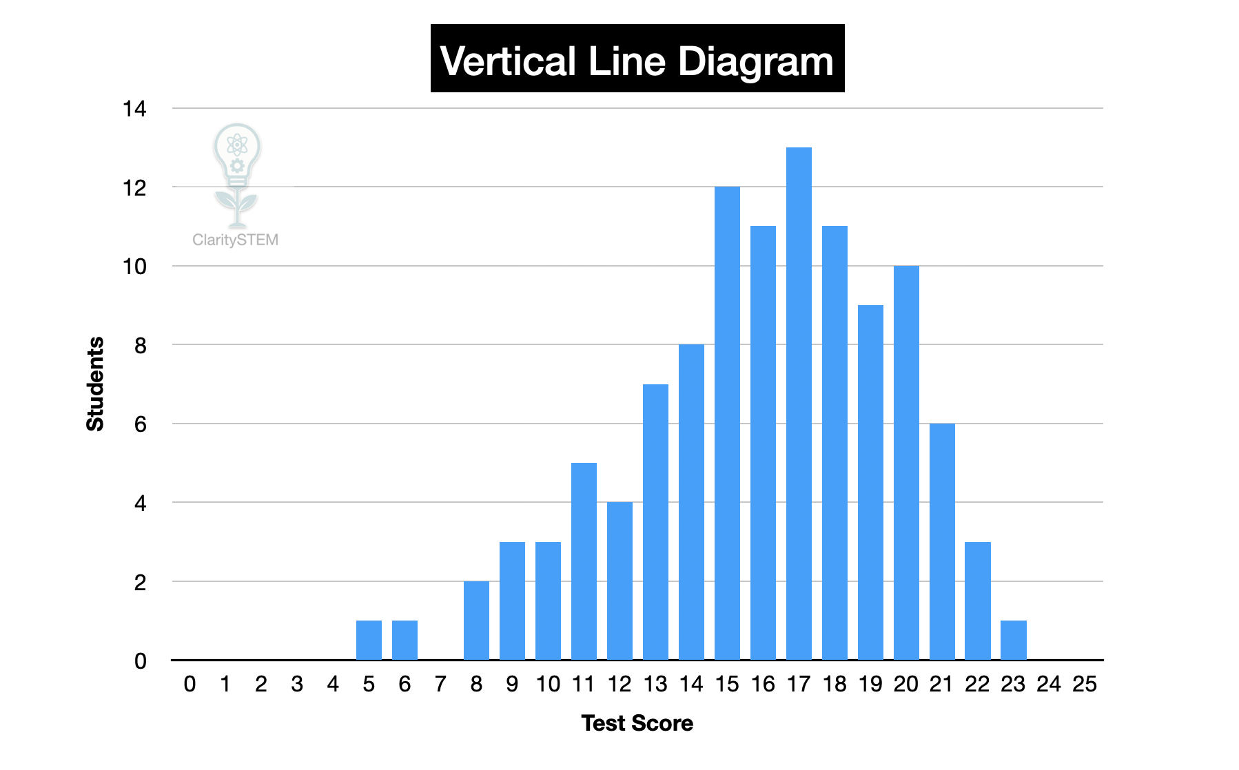
Vertical Line Diagrams for Discrete Data
A vertical line diagram is a way of representing discrete data by drawing vertical lines above a horizontal axis. Each line represents the frequency of a particular value. These diagrams are sometimes called line plots.
What a Vertical Line Diagram Is
In a vertical line diagram:
• the horizontal axis shows the discrete values
• vertical lines are drawn above each value
• the height of each line shows the frequency
Each vertical line represents how many times that value occurs in the data.
Vertical line diagrams are suitable only for discrete data, where values are separate and distinct.
Constructing a Vertical Line Diagram
To construct a vertical line diagram:
First list all the data values and count how often each one occurs.
Draw a horizontal axis and label it with the possible values.
Choose a suitable vertical scale for frequency.
Above each value, draw a vertical line up to the correct frequency.
Label the axes clearly and give the diagram a title.
All vertical lines should be the same width and drawn accurately.
Each value must have its own position on the axis
Interpreting a Vertical Line Diagram
To interpret a vertical line diagram:
Look at the height of each line to find the frequency.
Identify the value with the tallest line, which is the most common value.
Identify values that occur least often by finding the shortest lines.
Compare frequencies by comparing line heights.
You can also find the total number of data values by adding all frequencies.
Vertical line diagrams make patterns easy to spot.
Advantages of Vertical Line Diagrams
Vertical line diagrams:
• are clear and simple to read
• make comparison between values easy
• show exact frequencies
• work well for small to medium data sets
They are especially useful when data values are closely spaced.
Limitations of Vertical Line Diagrams
Vertical line diagrams:
• are not suitable for continuous data
• can become crowded if there are many different values
• are less effective for very large data sets
In these cases, grouped frequency tables or other graphs may be better.
Common Errors to Avoid
Common mistakes include:
• using vertical line diagrams for continuous data
• missing values on the horizontal axis
• incorrect frequency scales
• uneven or unclear line heights
Careful counting and clear scales prevent these errors.
Key Points to Remember
Vertical line diagrams are used for discrete data.
Each vertical line represents a frequency.
The height of the line shows how often a value occurs.
They allow quick comparison between values.
They are simple but must be drawn accurately.
Understanding how to construct and interpret vertical line diagrams helps present discrete data clearly and supports accurate data analysis.