Misleading Graphs
Graphs are powerful tools for presenting data, but they can sometimes be misleading. Being able to recognise when a graph gives a false or distorted impression is an important skill in statistics and in everyday life, especially when interpreting information in the media.
Why Graphs Can Be Misleading
Graphs can be misleading either intentionally or unintentionally.
A graph may appear to show a strong trend or difference when the data does not actually support it.
This often happens because of how the graph is drawn rather than what the data says.
Common Ways Graphs Can Be Misleading
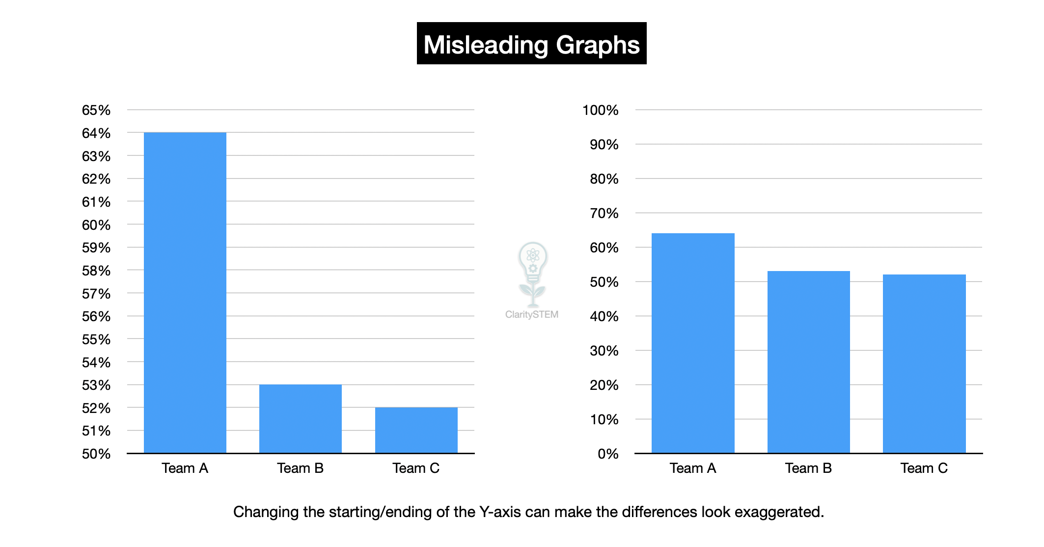
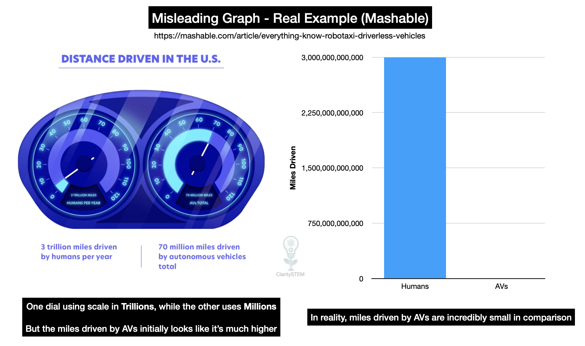
One common issue is an inappropriate scale.
If the vertical axis does not start at zero, small differences can appear much larger than they really are.
Another issue is uneven scales.
If the scale changes part way along an axis, the graph may exaggerate or hide trends.
Graphs can also be misleading if:
• axes are not labelled clearly
• units are missing or unclear
• data has been omitted
• categories are selected unfairly
Each of these can change how the data is interpreted.
Misleading Visual Design
Visual choices can also affect interpretation.
For example:
• very wide or narrow bars
• 3-D effects on bar charts or pie charts
• distorted proportions
These features can make differences look larger or smaller than they really are.
Visual impact does not equal accuracy
Misuse of Graph Types
Using the wrong type of graph can mislead.
For example:
• using a line graph for discrete data
• using a pie chart when totals are unclear
• using a bar chart with unequal widths
The graph type should match the data being shown.
Selective or Biased Data
Graphs may also be misleading because of selective data.
This can include:
• choosing a limited time period
• excluding certain categories
• focusing on only part of a data set
Even if the graph is drawn correctly, the conclusions may be misleading if the data is incomplete.
How to Critically Interpret Graphs
When interpreting a graph, always check:
• the axis labels and units
• the scale and starting points
• whether all relevant data is included
• whether the graph type is appropriate
Ask whether the visual impression matches what the numbers actually show.
Drawing Sensible Conclusions
A reliable conclusion should:
• be based on the data, not just the picture
• acknowledge any limitations
• avoid over interpretation
Being cautious helps prevent being misled.
Key Points to Remember
Graphs can distort data if drawn poorly.
Scales and labels strongly affect interpretation.
Visual effects can exaggerate differences.
Selective data can mislead even with correct graphs.
Always question whether a graph gives a fair picture.
Recognising misleading graphs helps you interpret data accurately, avoid false conclusions and become a more critical consumer of information.