Scatter Diagrams for Paired Variables
A scatter diagram is used to display data for paired variables. Each pair of values is plotted as a single point on a graph. Scatter diagrams are useful for investigating relationships between two variables.
Paired Variables
Paired variables are two measurements taken from the same individual, item or situation.
Examples include:
• height and arm span
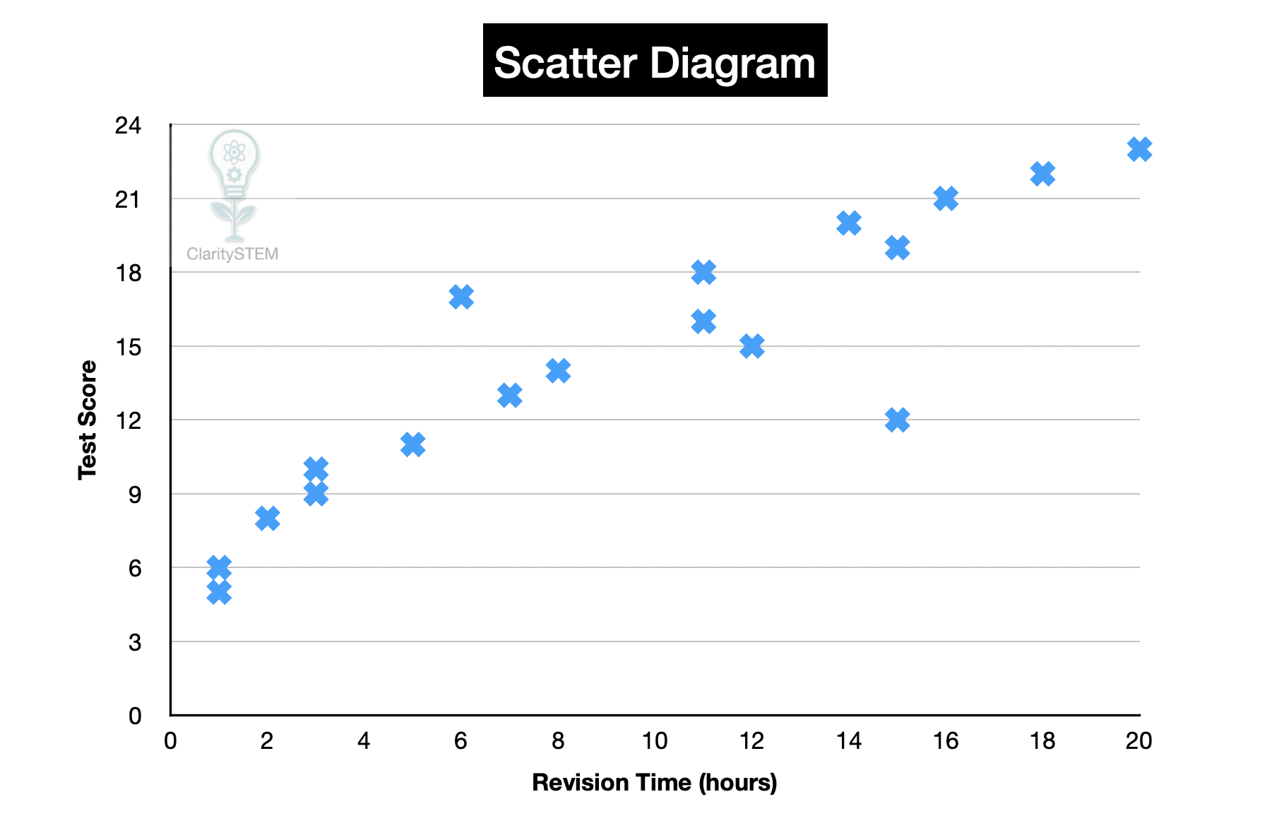
• time spent revising and test score
• temperature and ice cream sales
Each data point consists of one value for each variable.
Both values must come from the same source
Constructing a Scatter Diagram
To construct a scatter diagram:
Choose suitable axes and draw them clearly.
Place one variable on the horizontal axis and the other on the vertical axis.
Choose appropriate, even scales for both axes.
Plot each pair of values as a single point.
Do not join the points with lines.
Label both axes clearly and include units where appropriate.
Each point should be plotted accurately.
Interpreting a Scatter Diagram
Scatter diagrams are used to look for a relationship between the variables.
When interpreting a scatter diagram, look for:
• a general pattern or trend
• how closely the points follow that pattern
• any points that do not fit the pattern
Common patterns include:
• positive correlation, where one variable increases as the other increases
• negative correlation, where one variable decreases as the other increases
• no correlation, where there is no clear pattern
The closer the points are to a straight line, the stronger the relationship.
Anomalies
An anomaly is a point that does not fit the general pattern.
Anomalies may be caused by:
• measurement errors
• unusual conditions
• recording mistakes
Anomalies should be identified and considered, not ignored.
They may affect conclusions drawn from the data.
Limitations of Scatter Diagrams
Scatter diagrams:
• show relationships but do not prove cause and effect
• may be influenced by anomalies
• rely on accurate data
A relationship seen in a scatter diagram does not mean one variable causes the other to change.
Correlation does not imply causation
Using Scatter Diagrams Effectively
Scatter diagrams can be used to:
• describe relationships
• compare different data sets
• support or reject hypotheses
They are often used as a starting point for further analysis.
Key Points to Remember
Scatter diagrams display paired data values.
Each point represents one pair of values.
They are used to identify relationships between variables.
Points are not joined by lines.
Anomalies should be identified and discussed.
Being able to construct and interpret scatter diagrams allows relationships in data to be explored clearly and accurately.