Cumulative Frequency Tables and Diagrams
⭐ Higher Tier Content
Cumulative frequency is used to show how many data values are less than or equal to a given value. Cumulative frequency tables and diagrams are particularly useful for grouped and continuous data and allow estimates of the median, interquartile range and percentages to be found.
Cumulative Frequency Tables
A cumulative frequency table is formed from a frequency table.
It shows:
• class intervals or values
• frequency for each class
• cumulative frequency
The cumulative frequency is found by adding frequencies progressively down the table.
Each cumulative frequency tells you how many values are at or below the upper boundary of that class.
The final cumulative frequency equals the total number of data values
Constructing a Cumulative Frequency Table
To construct a cumulative frequency table:
List the class intervals or values in ascending order.
Write down the frequency for each class.
Add frequencies cumulatively, starting from the first class.
Record the running total in the cumulative frequency column.
Check that the final cumulative frequency matches the total number of observations.
Cumulative Frequency Diagrams
A cumulative frequency diagram is a graph that shows cumulative frequency against value.
It is sometimes called an ogive.
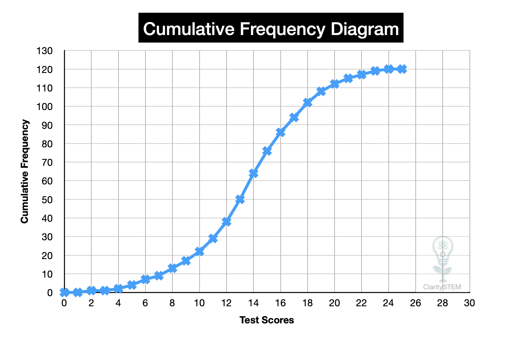
Constructing a Cumulative Frequency Diagram
To construct a cumulative frequency diagram:
• draw axes
• put the data values or upper class boundaries on the horizontal axis
• put cumulative frequency on the vertical axis
• plot points using cumulative frequency values
• join the points with a smooth curve
The curve should always increase and never decrease.
Axes must be clearly labelled and drawn to a suitable scale.
Interpreting a Cumulative Frequency Diagram
Cumulative frequency diagrams allow you to:
• see how data accumulates
• compare distributions
• estimate key statistics
Values are read by moving:
• horizontally from a frequency to the curve
• then vertically down to the horizontal axis
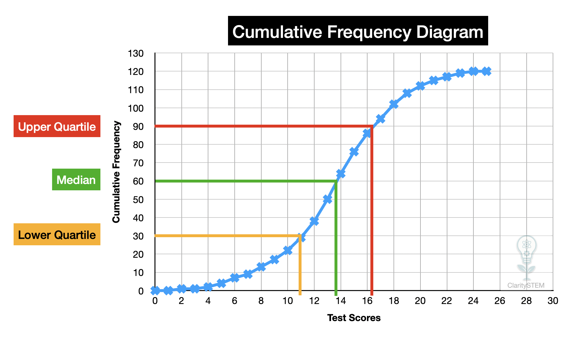
Estimating the Median
The median is the middle value of the data.
To estimate the median:
• find the total frequency
• halve it to find the median position
• move horizontally from this value on the cumulative frequency axis to the curve
• then drop vertically to the horizontal axis
The value read is an estimate of the median.
Estimating Quartiles and Interquartile Range
The lower quartile is the value at one quarter of the total frequency.
The upper quartile is the value at three quarters of the total frequency.
To estimate quartiles:
• find one quarter and three quarters of the total frequency
• read the corresponding values from the graph
The interquartile range is found by subtracting the lower quartile from the upper quartile.
Because values are read from a graph, the result is an estimate.
Estimating Percentages
Cumulative frequency diagrams can also be used to estimate percentages.
To find the percentage of data below a given value:
• read the cumulative frequency at that value
• divide by the total frequency
• convert to a percentage
To find the value below which a certain percentage lies:
• calculate that percentage of the total frequency
• read the corresponding value from the graph
Percentages found in this way are estimates.
Limitations of Cumulative Frequency
Cumulative frequency diagrams:
• give estimates, not exact values
• depend on accurate grouping and scales
• are less precise with wide class intervals
Narrower class intervals give more accurate estimates.
Common Errors to Avoid
Common mistakes include:
• using midpoints instead of class boundaries
• plotting frequency instead of cumulative frequency
• misreading scales
• treating estimates as exact values
Careful reading of axes is essential.
Key Points to Remember
Cumulative frequency shows how data builds up.
Tables are formed by running totals of frequency.
Diagrams plot cumulative frequency against value.
The median, quartiles and percentages can be estimated.
All values read from cumulative frequency graphs are estimates.
Constructing and interpreting cumulative frequency tables and diagrams allows large data sets to be analysed effectively and supports estimation of important statistical measures.