Pictograms, Bar Charts and Pie Charts
Pictograms, bar charts and pie charts are used to represent data visually. They are suitable for qualitative (categorical) data and discrete quantitative data and help patterns and comparisons to be seen clearly.
Using these charts correctly involves both constructing them accurately and interpreting what they show.
Pictograms
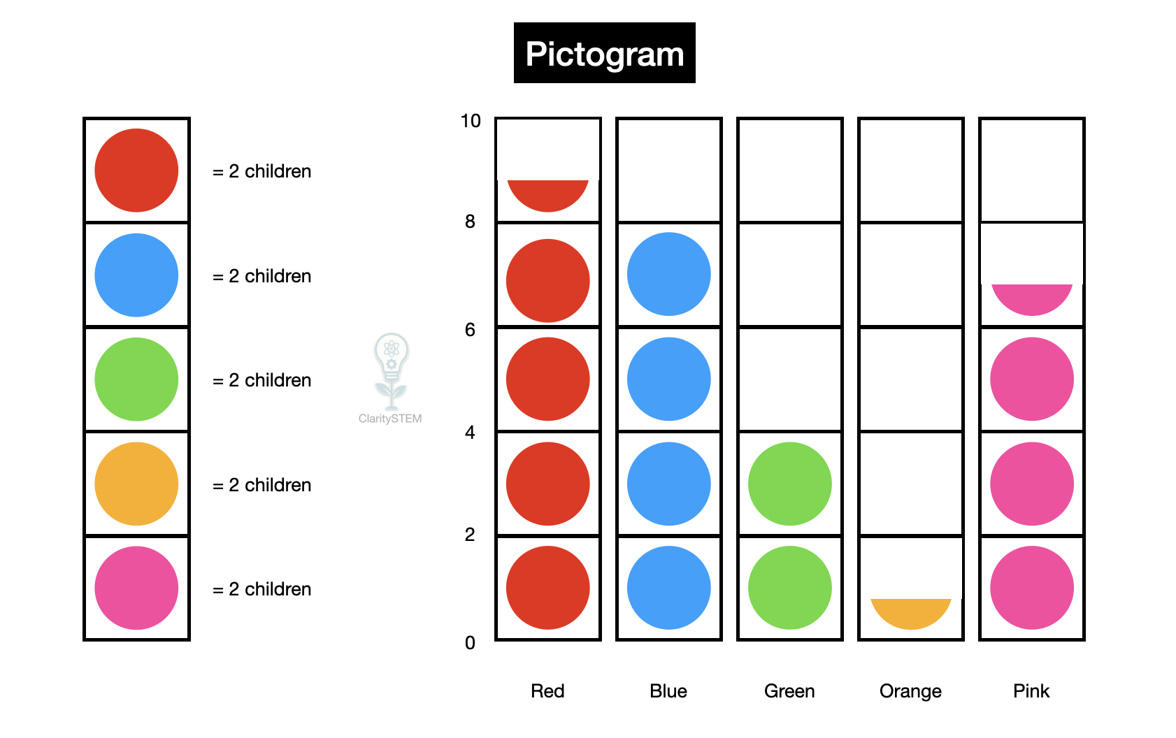
A pictogram uses pictures or symbols to represent data values.
Each symbol represents a fixed number of items, called a key.
When constructing a pictogram:
• choose a clear symbol
• state the key clearly
• use the same size symbol throughout
• allow half symbols if needed
For example, one symbol might represent 2 people or 5 votes.
When interpreting a pictogram:
• read the key carefully
• count symbols and partial symbols
• multiply by the value of the key
Pictograms are easy to read but can be inaccurate if symbols are unclear
Bar Charts
A bar chart uses rectangular bars to represent frequencies.
Bar charts are suitable for:
• qualitative data
• discrete quantitative data
When constructing a bar chart:
• draw two labelled axes
• put categories or values on the horizontal axis
• put frequency on the vertical axis
• draw bars of equal width
• leave gaps between bars
The height of each bar represents the frequency.
When interpreting a bar chart:
• compare bar heights
• identify the most and least frequent categories
• read frequencies from the scale
Bar charts make comparisons between categories clear.
Pie Charts
A pie chart shows how a whole is divided into parts.
Each sector represents a category, and the size of the sector shows its proportion of the total.
Pie charts are used for:
• qualitative data
• discrete quantitative data
When constructing a pie chart:
• find the total frequency
• calculate the proportion for each category
• convert proportions into angles
• draw sectors accurately
The full circle represents the whole data set.
When interpreting a pie chart:
• compare the sizes of sectors
• identify the largest and smallest proportions
• remember that pie charts show proportions, not exact values
Pie charts are useful for showing relative size
Choosing the Correct Chart
Different charts suit different purposes.
Pictograms are good for simple data and younger audiences.
Bar charts are best for clear comparison of frequencies.
Pie charts are best for showing how data is split as parts of a whole.
The choice of chart affects how easily data can be understood.
Common Errors to Avoid
Common mistakes include:
• missing or unclear keys in pictograms
• uneven bar widths or missing gaps in bar charts
• incorrect totals when drawing pie charts
• misreading scales or proportions
Clear labels and accurate construction prevent these errors.
Key Points to Remember
Pictograms use symbols and a key to represent data.
Bar charts use bar height to show frequency.
Pie charts show proportions of a whole.
These charts are suitable for qualitative and discrete quantitative data.
Careful construction and interpretation are essential.
Being able to construct and interpret pictograms, bar charts and pie charts allows data to be communicated clearly and comparisons to be made effectively.