Drawing and Interpreting Real Life Graphs
Graphs are often used to model real life situations. In these cases, the axes represent real quantities and the shape of the graph has a practical meaning. Being able to draw and interpret these graphs helps you understand how one quantity changes in relation to another.
Conversion Graphs
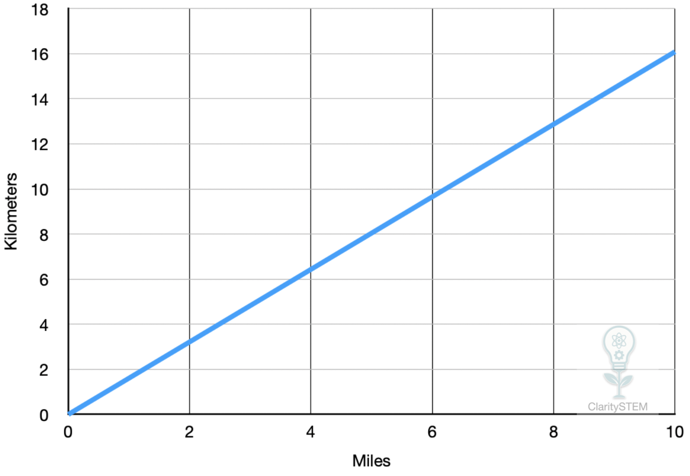
Conversion graphs show how one unit is converted into another using a constant rate.
Typical examples include currency conversion, miles to kilometres, or kilograms to pounds.
A conversion graph is always a straight line because the relationship between the two quantities is proportional.
The equation of a conversion graph has the form
\( y = mx \)
where m is the conversion factor.
Example
$$
y = 1.6x
$$
This could represent converting miles into kilometres.
The graph:
• passes through the origin
• has a constant gradient
• shows that doubling one quantity doubles the other
Interpreting the graph involves reading off equivalent values on the two axes.
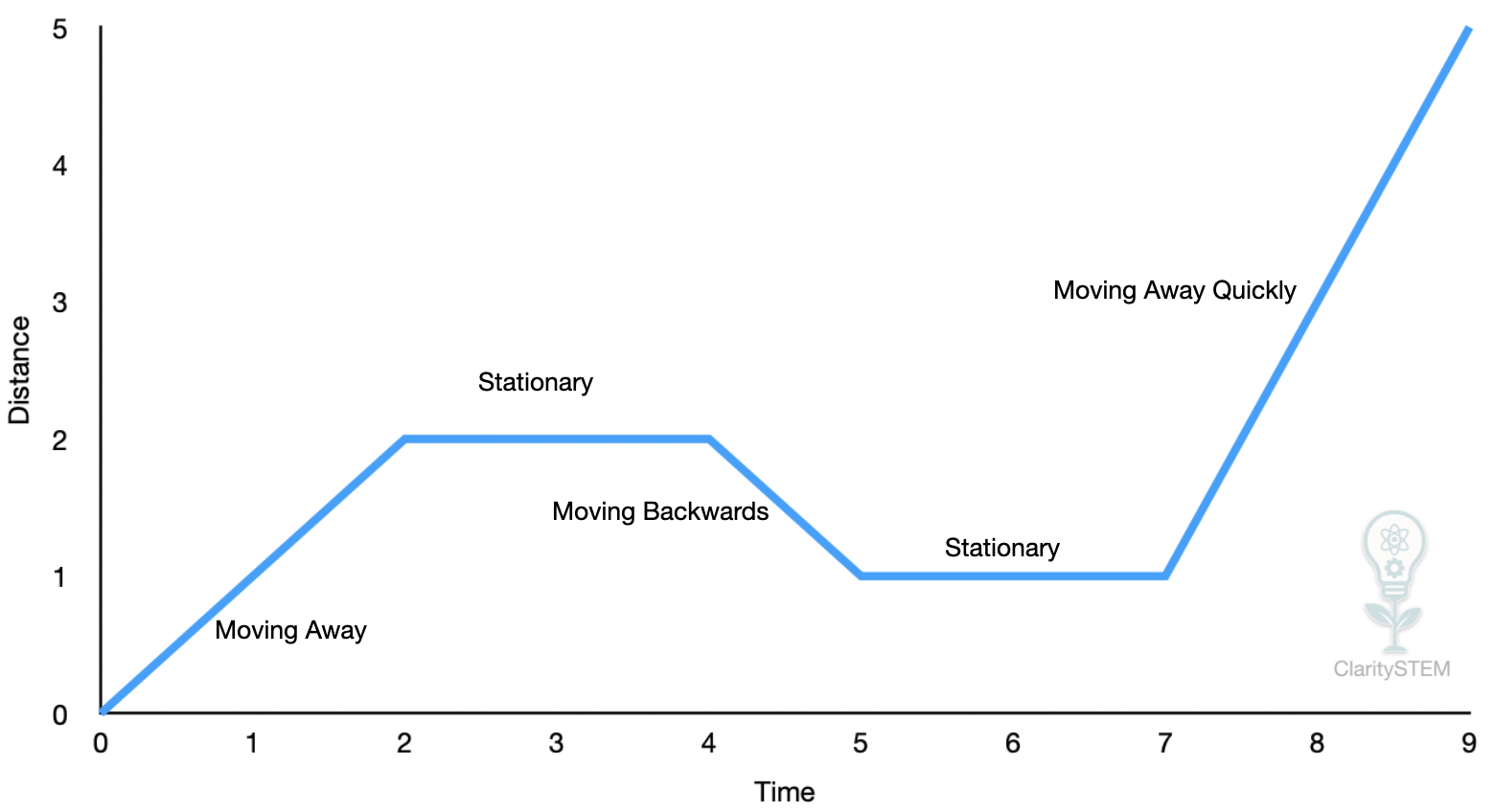
Travel Graphs
Travel graphs usually show distance against time.
The horizontal axis represents time.
The vertical axis represents distance from a starting point.
The gradient of the graph represents speed.
A steeper line means a faster speed.
A horizontal line means the object is stationary.
A straight sloping line means constant speed.
Example
$$
y = 50x
$$
This could represent travelling at a constant speed of 50 km per hour.
Changes in the shape of the graph show changes in motion.
A curved graph means the speed is changing.
A downward sloping line means the object is returning towards the start.
The gradient tells you how fast the object is moving
Interpreting Travel Graphs
When interpreting travel graphs, focus on what each section means.
Look at:
• how steep the graph is
• whether the graph is straight or curved
• whether the distance is increasing, decreasing or constant
From this, you can describe the motion in words.
For example, a graph that rises, then becomes horizontal, then rises again shows moving, stopping, then moving again.
Other Graphs That Describe Real Life Situations
Many other graphs are used to describe real situations.
Examples include:
• temperature changing over time
• water level filling or emptying a container
• population growth
• phone battery level over a day
The key skill is linking the shape of the graph to what is happening in real life.
A steadily rising graph shows a constant increase.
A curve that flattens shows growth slowing down.
A sudden drop shows a rapid decrease.
Always consider:
• what each axis represents
• what the gradient means in context
• what different sections of the graph describe
Key Points to Remember
Conversion graphs are straight lines through the origin.
The gradient of a conversion graph is the conversion rate.
On travel graphs, gradient represents speed.
Horizontal sections show no movement.
Real life graphs must be interpreted in context.
Real life graphs turn mathematical relationships into meaningful descriptions of everyday situations, allowing you to explain changes clearly and accurately.