Box and Whisker Diagrams
⭐ Higher Tier Content
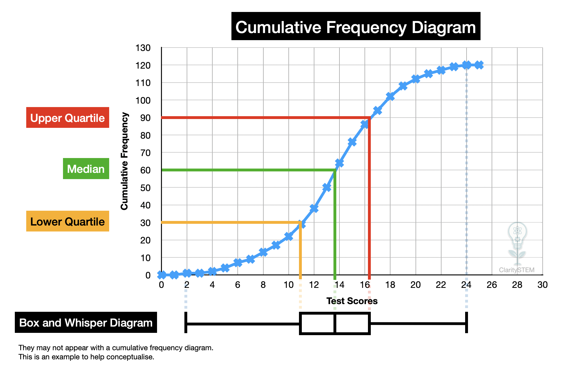
A box and whisker diagram is used to show the distribution of a data set. It is based on the five number summary and is particularly useful for comparing distributions.
What a Box and Whisker Diagram Shows
A box and whisker diagram displays:
• the minimum value
• the lower quartile
• the median
• the upper quartile
• the maximum value
These five values summarise how the data is spread.
The box shows the middle half of the data.
The whiskers show the spread of the remaining data.
Understanding the Features
The median is shown by a line inside the box.
The lower quartile is the left edge of the box.
The upper quartile is the right edge of the box.
The interquartile range is the length of the box and represents the spread of the middle half of the data.
The range is shown by the full length from the minimum to the maximum.
Interpreting a Box and Whisker Diagram
When interpreting a box and whisker diagram, you can:
• identify the typical value using the median
• judge the spread using the interquartile range
• see how spread out the data is using the range
• identify whether the data is skewed
If the median is closer to one end of the box, the data is not evenly distributed.
Comparing Distributions
Box and whisker diagrams are especially useful for comparing two or more data sets.
When comparing distributions, consider:
• the medians
• the interquartile ranges
• the overall ranges
• the shape of the distributions
Comparing medians shows which data set has higher typical values.
Comparing interquartile ranges shows which data set is more consistent.
Comparing ranges shows which data set has the greatest overall spread.
Same scale must be used when comparing diagrams
Interpreting Skewness
A distribution may be:
• symmetrical
• positively skewed
• negatively skewed
If the right whisker is longer, the data may be positively skewed.
If the left whisker is longer, the data may be negatively skewed.
Skewness affects which measure of central tendency is most appropriate.
Advantages of Box and Whisker Diagrams
Box and whisker diagrams:
• summarise data clearly
• make comparisons easy
• show spread and centre together
• are not affected by the shape of the data
They are particularly useful when comparing exam results, times or measurements.
Limitations
Box and whisker diagrams:
• do not show individual data values
• do not show how data is clustered within quartiles
• rely on accurate calculation of quartiles
They provide a summary rather than full detail.
Common Errors to Avoid
Common mistakes include:
• using different scales when comparing diagrams
• misidentifying quartiles
• confusing range with interquartile range
• ignoring the median when comparing typical values
Careful reading of the diagram avoids these errors.
Key Points to Remember
Box and whisker diagrams summarise data using five values.
The median shows the typical value.
The interquartile range shows the spread of the middle half.
They are useful for comparing distributions.
Comparisons must be made on the same scale.
Using box and whisker diagrams effectively allows distributions to be compared clearly and conclusions about centre and spread to be drawn accurately.