Interpreting Graphs Used in the Media
Graphs are often used in newspapers, online articles and social media to present information quickly. Being able to interpret graphical representations correctly is important, as some graphs can be misleading if they are poorly designed or intentionally manipulated.
Why Media Graphs Can Be Misleading
Graphs in the media are designed to attract attention and support a message. This means they do not always present data in a neutral or balanced way.
A graph may still be mathematically correct but can give a false impression if important details are hidden or distorted.
Always approach media graphs with a critical mindset.
Common Ways Graphs Can Be Misleading
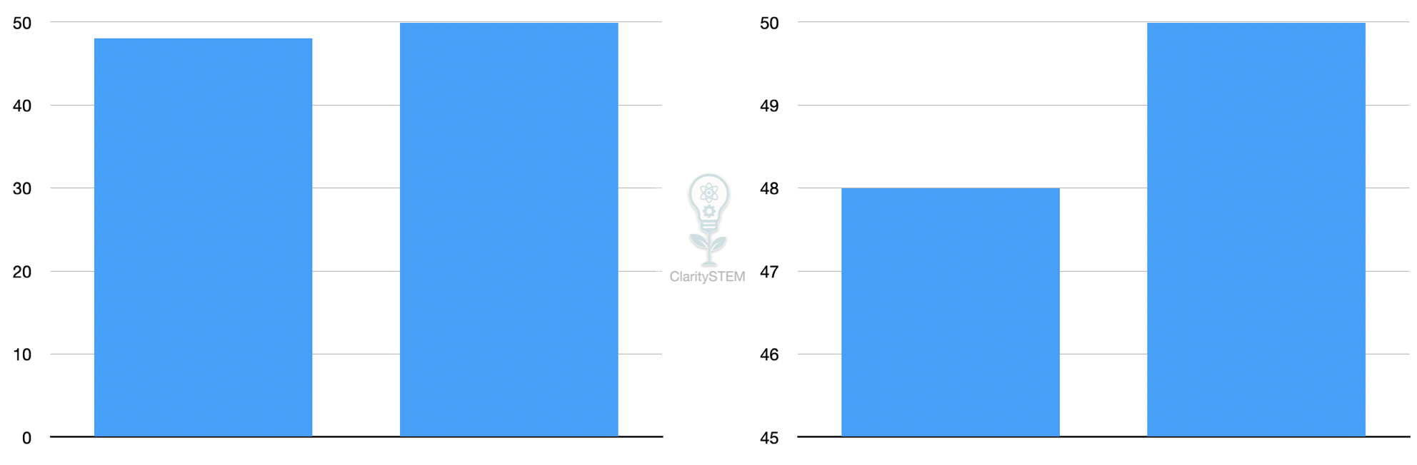
One common issue is a truncated axis.
If the vertical axis does not start at zero, small differences can appear much larger than they really are.
Example
$$
y = 50
$$
If a bar chart starts at 45 instead of 0, a change from 48 to 50 may look dramatic even though the actual change is small.
Another issue is unequal scales.
If intervals on an axis are not evenly spaced, the graph can exaggerate or hide trends.
Graphs may also use inappropriate graph types.
For example, using a line graph for unrelated categories can suggest a continuous trend that does not exist.
Interpreting Percentages and Proportions
Media graphs often use percentages to make changes sound significant.
Always check what the percentage is relative to.
A statement such as an increase of \( 50\% \) may sound large, but if the original value was very small, the actual change may be minor.
For example, increasing from 2 to 3 is an increase of \( 50\% \), but the difference is only 1.
Look for Missing or Selective Data
Some graphs only show part of the data.
They may:
• start or end at convenient points
• ignore longer term trends
• omit important categories
This can create a misleading narrative.
Always ask whether the graph shows the full context.
Interpreting Graphs Accurately
To interpret a graph properly, check the following:
• the labels on both axes
• the scale and starting point
• the units being used
• whether the graph type suits the data
• whether the data range has been restricted
Understanding these features helps you separate genuine trends from visual tricks.
The appearance of a graph can influence interpretation as much as the data itself
Key Points to Remember
Graphs in the media are designed to persuade as well as inform.
Axes that do not start at zero can exaggerate differences.
Percentages can be misleading without context.
Always check scales, labels and data ranges.
Question whether the graph fairly represents the data.
Being able to interpret and question graphs used in the media helps you make informed decisions and avoid being misled by visual presentations of data.