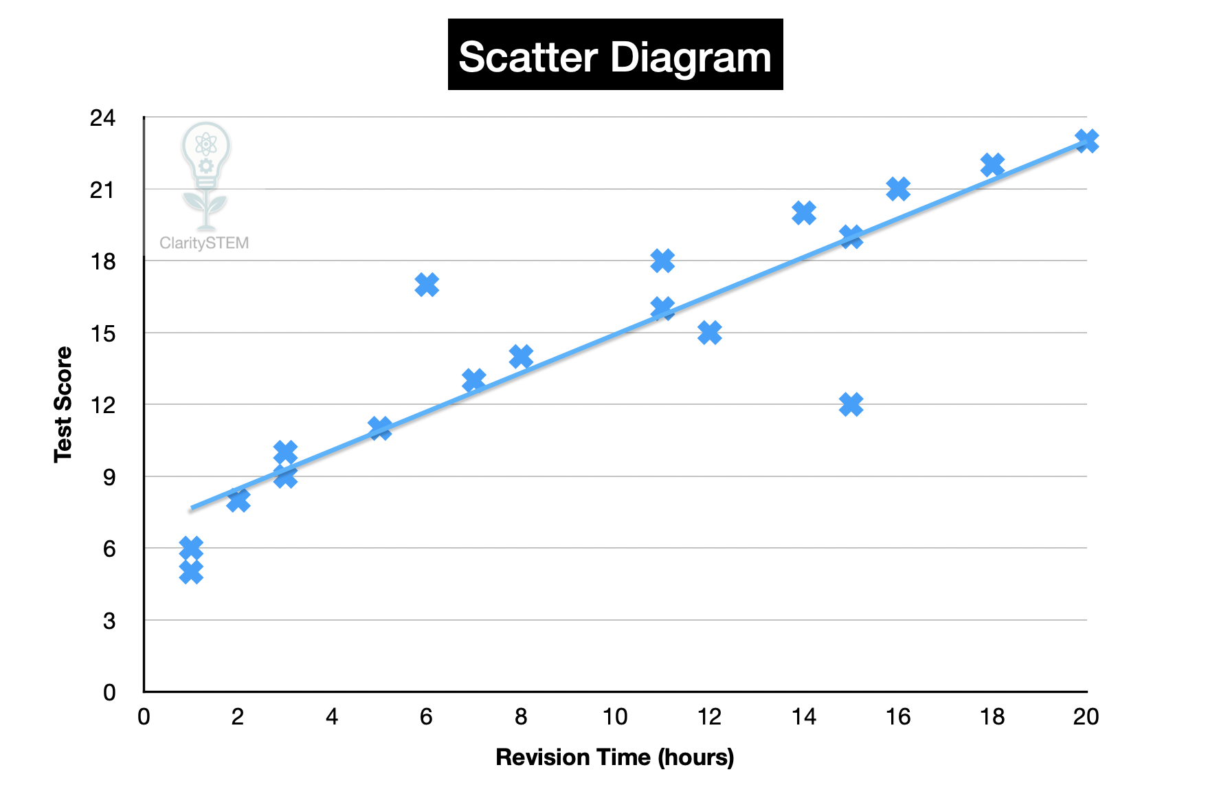
Lines of Best Fit
A line of best fit is drawn on a scatter diagram to show the overall trend in the data. It is used to summarise the relationship between two variables and to help with interpretation and prediction.
What a Line of Best Fit Represents
A line of best fit shows the general direction of the relationship between the paired variables.
It represents:
• the overall trend in the data
• how one variable tends to change as the other changes
The line does not pass through every point. Instead, it balances the points so that they are spread fairly evenly on both sides of the line.
The line is a model of the relationship, not an exact rule
Drawing a Line of Best Fit ‘By Eye’
To draw a line of best fit by eye:
Look at the overall pattern of the points.
Ignore any clear anomalies at first.
Draw a straight line that follows the general trend.
Aim for roughly the same number of points above and below the line.
The line should go through the middle of the cluster of points, not around the edge.
The line does not need to touch any particular point unless instructed.
Understanding the Mean Point
Sometimes a mean point is given, calculated or already plotted on the scatter diagram.
The mean point represents:
• the mean of the x values
• the mean of the y values
When a mean point is provided, the line of best fit must pass through this point.
This ensures the line represents the average position of the data.
When instructed, always draw the line through the mean point
Interpreting a Line of Best Fit
A line of best fit can be used to:
• describe the relationship between variables
• estimate values using interpolation
• make predictions
A line sloping upwards from left to right suggests a positive relationship.
A line sloping downwards from left to right suggests a negative relationship.
A nearly horizontal line suggests little or no relationship.
Predictions made using the line are estimates and may not be accurate.
Limitations of a Line of Best Fit
A line of best fit:
• does not prove cause and effect
• may be influenced by anomalies
• is only reliable within the range of the data
Predictions made far outside the data range are less reliable.
The line is only as good as the data used
Common Errors to Avoid
Common mistakes include:
• forcing the line through every point
• drawing a curved line when a straight line is required
• ignoring instructions about the mean point
• letting one anomaly determine the line
Careful judgement is required when drawing by eye.
Key Points to Remember
A line of best fit shows the overall trend in a scatter diagram.
It is drawn by eye to balance points above and below the line.
Anomalies should not dominate the line.
If a mean point is given, the line must pass through it.
The line helps with interpretation and estimation, not exact prediction.
Understanding how to draw and interpret a line of best fit allows relationships in data to be summarised clearly and used sensibly in statistical analysis.